Improving Lead Conversion Through UX Audit
UX audit of a B2B industrial equipment website focused on improving lead generation through data-driven, targeted UX improvements.
Role
UX/UI Designer
Duration
1 month
Deliverables
Context & Challenge
Improving lead generation for a B2B technical equipment website
The project focused on a B2B website selling and servicing industrial compressors. Since choosing the right equipment often requires expert consultation, the website's primary goal was to generate leads and connect potential customers with sales engineers.
The client had recently redesigned the website and was concerned that the redesign had affected its performance. The key business goals were to increase lead generation, organic search traffic, and search rankings.
My task was to identify UX issues that could be limiting conversions and recommend improvements based on user behavior data.
Constraint
The website was built on a predefined template, so instead of proposing a complete redesign, I focused on targeted UX improvements that could be implemented within the existing structure.
Solution
I used Yandex Metrica to analyze user behavior and identify friction points across key conversion scenarios. Depending on the hypothesis, I reviewed click maps, scroll maps, landing pages, conversion data, devices, and traffic sources.
The process was:
Analytics → Hypothesis → UX recommendation → Implementation → Measurement
01 — Quick Contact
Problem
On mobile, there was no persistent way to contact the company quickly, while the “Request a call” CTA didn't look sufficiently interactive.
Solution
I recommended making the quick-contact option more visible and improving the visual hierarchy of the CTA.
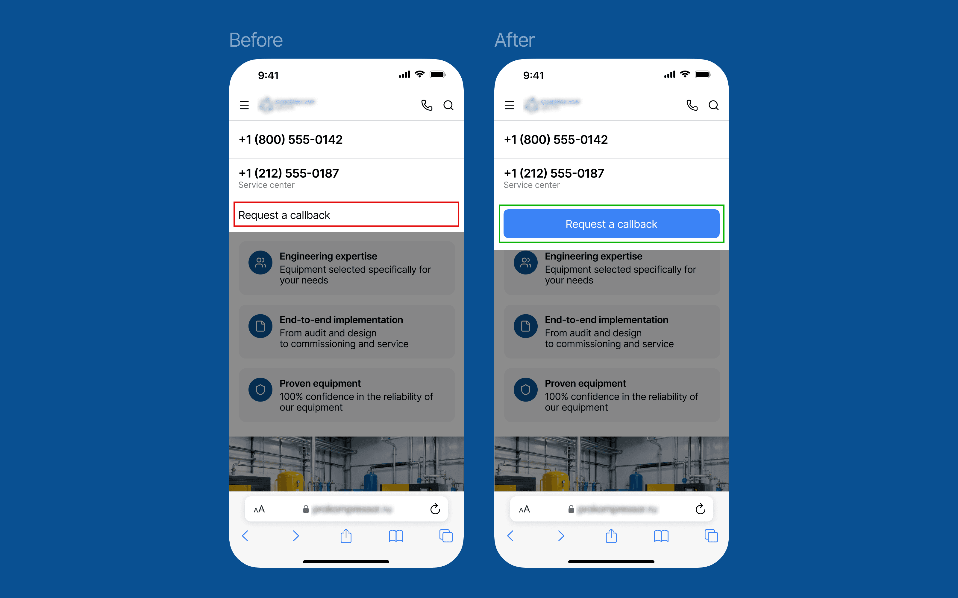
Results after implementation
Lead conversion
11.3× increase
Call-tracking conversion
4.8× increase
02 — Lead Generation Forms
Problem
The fields in the quote request form didn't fully match the user's reason for contacting the company. I also identified an issue with phone number input in the “Get an engineer's estimate” form on both desktop and mobile.
Solution
I recommended restructuring the forms around the user's intent and improving the phone input interaction.
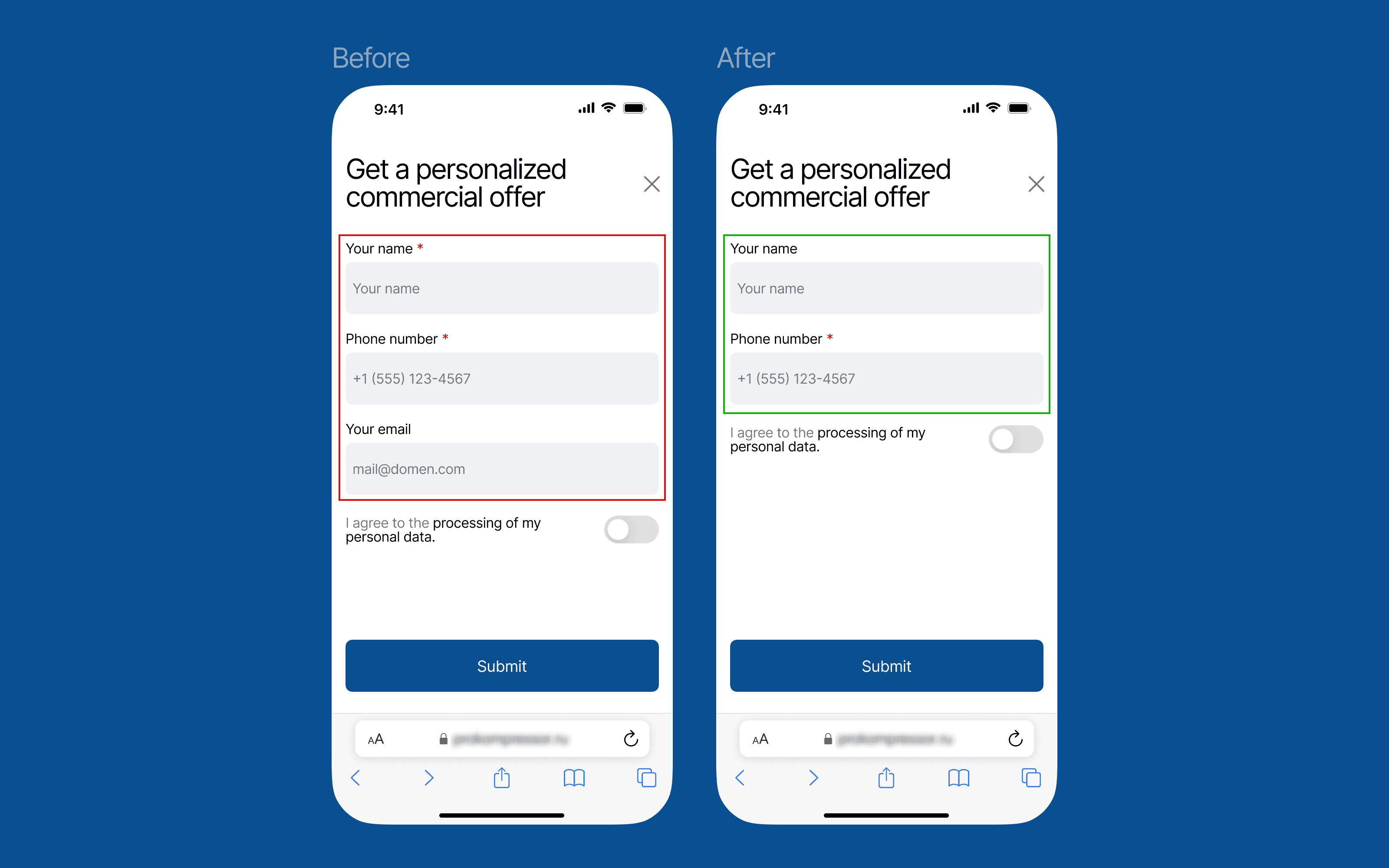
Results after implementation
Form submissions
2.65× increase
Contact submissions
1.76× increase
03 — Simplifying Equipment Selection
Problem
The homepage offered around 20 technical parameters users could choose from. Displaying all of them at once created a dense interface, while less frequently used parameters were largely overlooked.
Solution
I proposed showing only the 5–7 most relevant parameters by default, with a “Show more” button indicating how many additional options were available.
This reduced visual complexity while keeping the full range of parameters accessible when needed.

Results after implementation
Bounce rate
9% decrease
Pages per session
33% increase
Time on site
56% increase
Other projects


Ozon Seller Dashboard Redesign
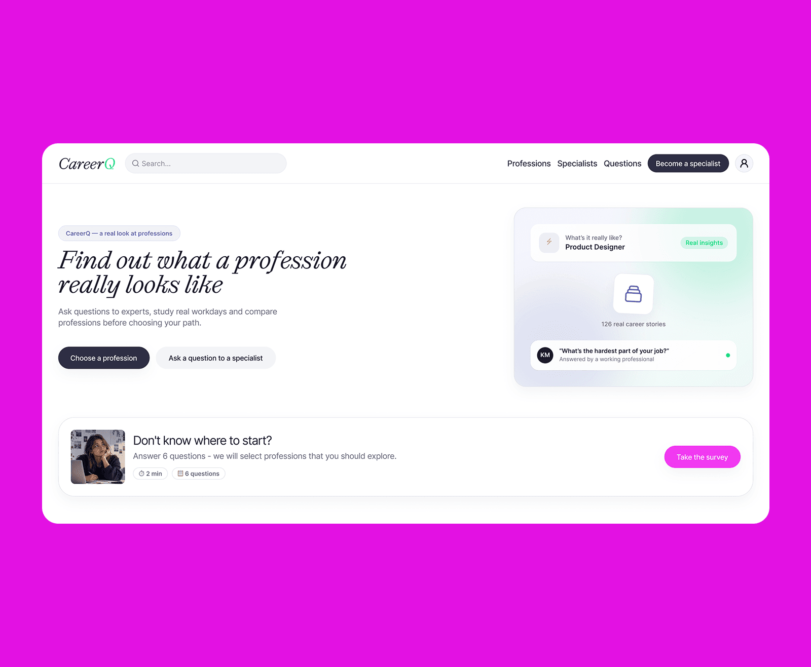

A platform that helps young people explore careers through the real experiences of people already working in them.

An end-to-end product design project for a hotel booking app, from UX research and product strategy to information architecture, UI design, and a scalable design system.